About this Case Study
This project was undertaken for the UX Design Diploma ran by the UX Design Institute I completed in 2022 where I passed with an overall score of 89%.
Project Outline
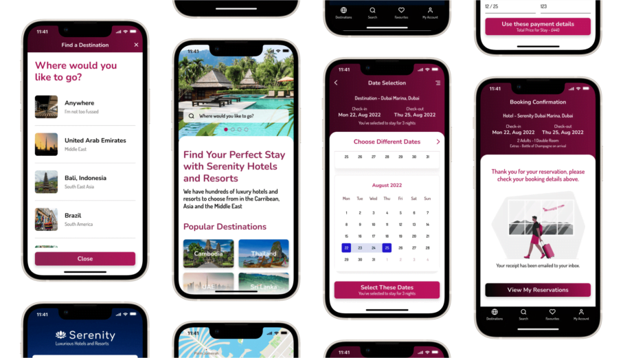
The project is focused on a fictional hotel and resort chain called Serenity Hotels and Resorts. They were in need of a new app to market and sell their hotel rooms and wanted to focus on providing their users with an accessible, enjoyable and stress free booking experience.
Responsibilities
Other than the analysis part of this project which I had a helper (Thank you Thais for your input), I was responsible for all the tasks including research, design with branding, prototyping and wireframing for developer handover.
Technologies Used
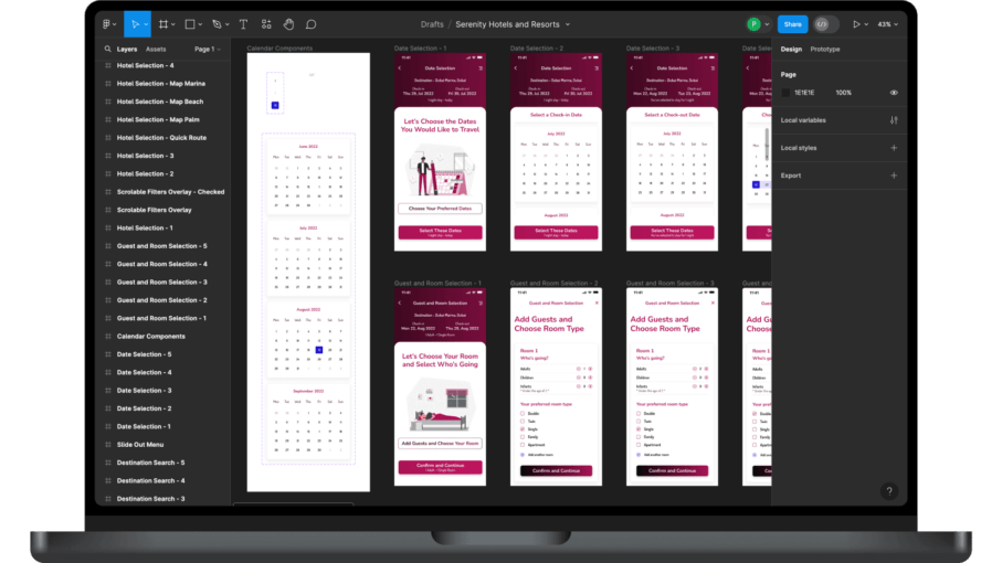
The primary design tool used in this project was Figma, with Photoshop for image manipulation, Miro for collaboration and diagrams like the affinity diagram, Reflector 4 for capturing screens in usability tests, and pen and paper for interaction design.
Deliverables
The deliverables for this project included a clickable prototype and wireframes with annotations for development handover.
Prototype
Design and build a clickable prototype that is focused on the hotel room booking process that can be tested with users.
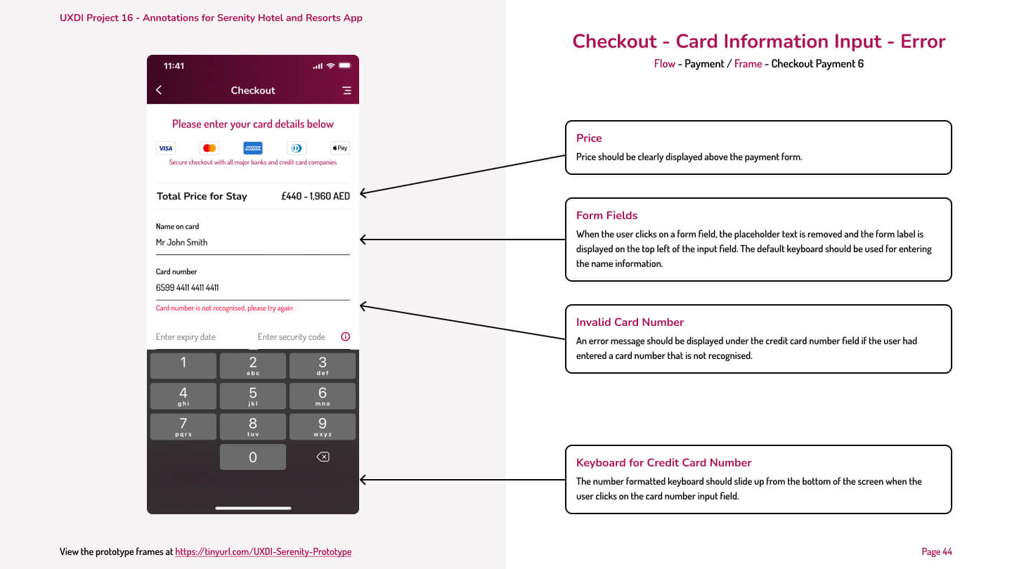
Developer Handover / Wireframes
Create a developer handover document with annotated wireframes to help the development team understand how to build the app.
The UX Design Process
The UX design process is a crucial component of creating a successful product or website. The stages involved with this case study included research, analysis, design, prototype development, and handover documentation for the development team.
Research
The discovery phase of this project included competitive benchmarking, an online survey and usability tests with in-depth interviews to gain valuable insights into user preferences and market dynamics.
Analysis
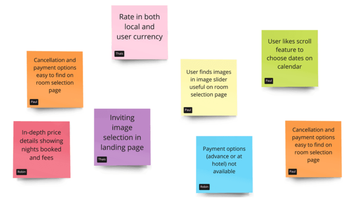
In order the understand the research that was gathered, an afinity diagram work shop was organised and then the findings from that were used to create a customer journey map to define the high-level steps the user will take in the booking process journey.
Design
Taking what I had found within the analysis phase, the next step was to create the flow diagram and screen flow documents to understand how the user will flow through the app. Low fidelity screen designs were then created with pen and paper.
Prototype
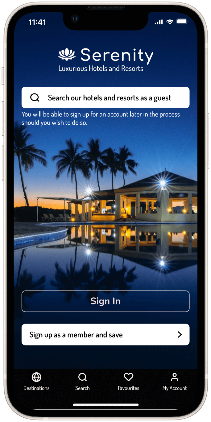
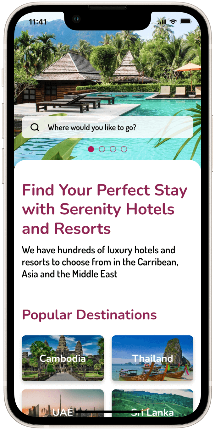
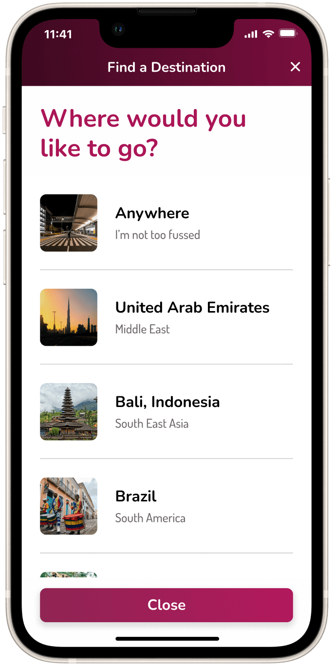
Following on from the hand drawn low fidelity screen designs with pen and paper, the designs were taken into figma to create the high fidelity screens for the prototype build.
Developer Handover
After the prototype was built, the screens were then annotated with the information the development team will need to understand and complete the build of the Serenity Hotels and Resorts app.
Research & User Testing
The research for this case study included a competitive benchmarking, an online survey, and usability testing with in-depth interviews.
UX Research #1
Competitive Benchmarking
The hotel industry is a highly competitive market with numerous players vying for customers' attention and business.
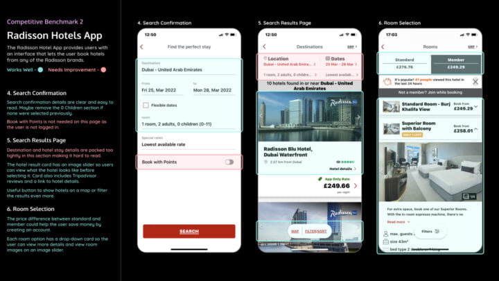
As such, it's important for hotels and vacation rental companies to regularly conduct competitive benchmarking research. In this competitive benchmarking research, I analysed the hotel room booking experiences of four major players in the industry: Shangri-La, Hilton, Radisson Hotels, and Airbnb.
My research included an analysis of each of the company's mobile apps to find out what industry best practices should be followed and what bad practices are to be avoided to facilitate the best user journeys as possible for the new Serenity Hotels and Resorts hotel room booking app.


UX Research #2
Online Survey
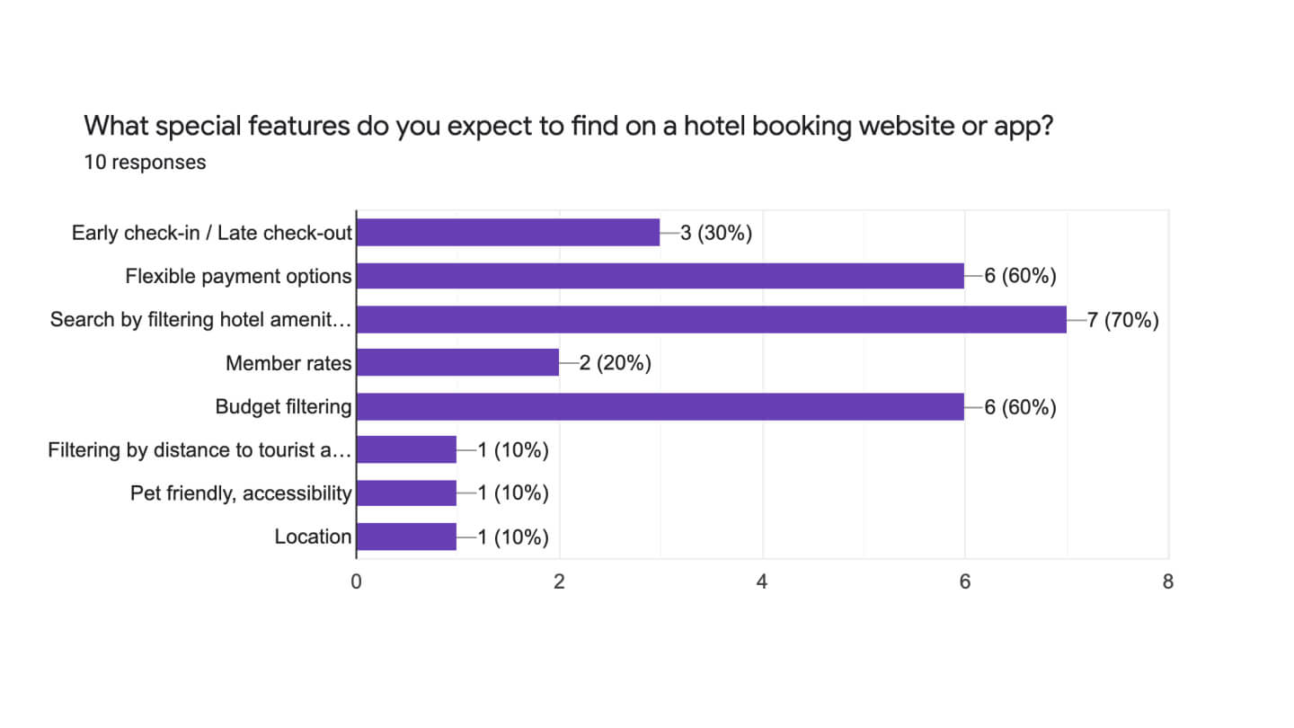
To get to understand some of the habits and thoughts of users while they are booking hotel rooms online, I created a 10-question survey using Google Forms and was shared with family and friends and also on social media. The results were then analysed and documented to be used in future within the project.
UX Research #3
Usability Testing
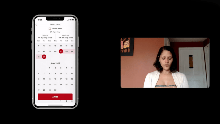
As part of the project and to improve the hotel booking experience for users, I conducted an in-person in-depth interview and a usability test for two popular hotel chains, Hilton and Radisson. The test was recorded using Reflector 4 to capture what the user was doing while navigating the apps along with QuickTime Pro to capture the user’s reactions.
The goal of this test was to evaluate the users experience of the hotel booking process on each of their mobile apps with the aim of identifying areas for improvement and positive interactions and ultimately enhancing the user experience on the new Serenity Hotels and Resorts App.
I also had access to some recent usability tests which included in-depth interviews that covered the room booking process for the Barcelo and Doyle Collection hotel chains. Having access to other usability tests gave me more valuable research data to work with.
Research Findings
Listed below are some of the research findings that stood out that will help with the design of the Serenity hotel room booking app.
 Competitive Benchmarking
- Most of the hotel room booking apps have a search feature on the landing page.
- All the apps used very similar processes to let the user add dates, guests and destinations so these seem to be industry best practices.
- Some of the apps didn’t use the correct keyboard for the form that the user was filling in.
- Some apps performed better with providing information about the hotels on the search results and room selection pages.
 Online Survey
- 7 out of the 10 participants said it was important to have up to date images for the hotel facilities and hotel rooms they were booking.
- The feature that was expected the most in this question was search by filtering hotel amenities.
- The most popular ways to access the hotel booking services were on a mobile phone app or a desktop/laptop computer.
- Users would like to see flexible payment options and budget filtering features.
 Usability Testing
- Users liked to see image sliders featured on apps with real photos of the hotel rooms and amenities.
- Users liked to view clearly displayed prices for rooms with different options available such as including breakfast or free cancelation.
- Most users mentioned that they want to see reviews on hotel booking apps, and most would like to see reviews from TripAdvisor.
- Map features and filtering options were important to most users.
Analysis & Brainstorming
An affinity diagram session was set up to break down the research into manageable chunks before organising that data within a customer journey map.
Analysis & Brainstorming #2
Customer Journey Map
Taking the now organised data from the Affinity Diagram, a customer journey map was created to define the high-level steps in the booking process journey the user will be taking.
Each step in the process was evaluated to document how the user might be feeling, the pain points and positive interactions and the most common user behaviours that were found during the research phase.

UX / UI Design & Prototype
The initial stage for the design process was to create the flow diagram and screen flow, this was followed by the Interaction design that was hand sketched then annotated.
UX/UI Design & Prototype #1
Flow Diagram
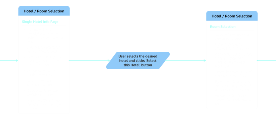
The flow diagram represents the the most common route the user will take from the landing screen to the booking confirmation screen.
The flow diagram was sketched out by hand before being recreated and improved on in Figma. An alternative flow route was included in the diagram for when a user would prefer to sign up for an account rather than going through the process as a guest.
UX/UI Design & Prototype #2
Screen Flow
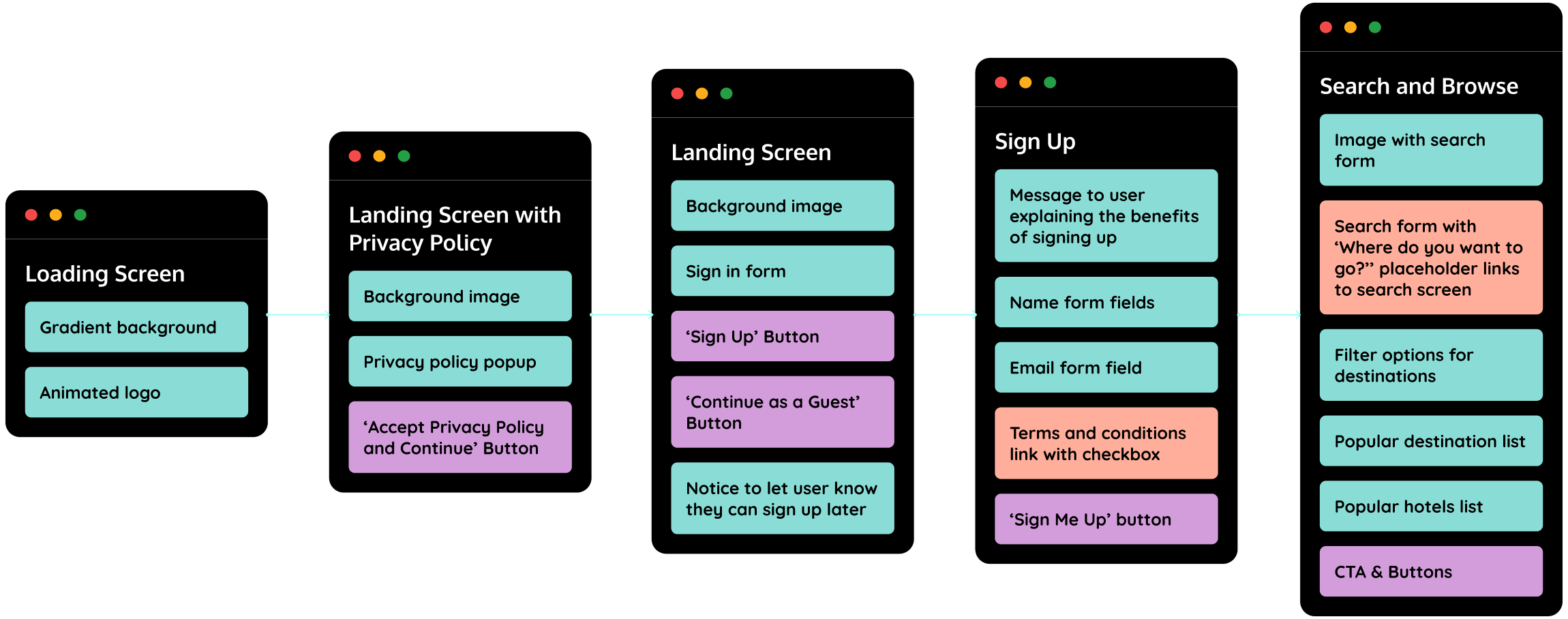
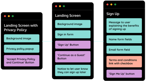
Taking the now organised data from the Affinity Diagram, a customer journey map was created to define the high-level steps in the booking process journey the user will be taking.
Each step in the process was evaluated to document how the user might be feeling, the pain points and positive interactions and the most common user behaviours that were found during the research phase.
UX/UI Design & Prototype #3
Screen States
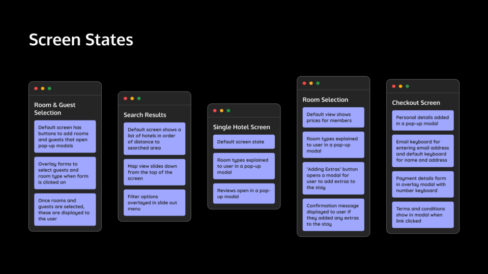
Any screens that had different screen states such as content updates, pop ups or keyboards opening were illustrated in the screen states document.
UX/UI Design & Prototype #4
Interaction Design
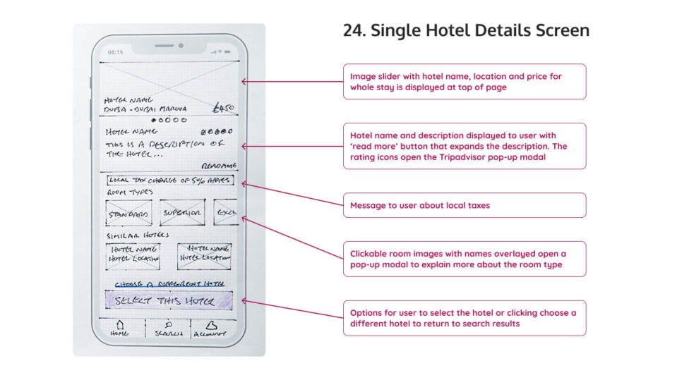
Each screen of the app was hand sketched on top of iPhone screen templates and then each screen was photographed to have a digital copy.
The photos were then imported to a Figma document and annotations were added to explain any of the features on each screen.
UX/UI Design & Prototype #5
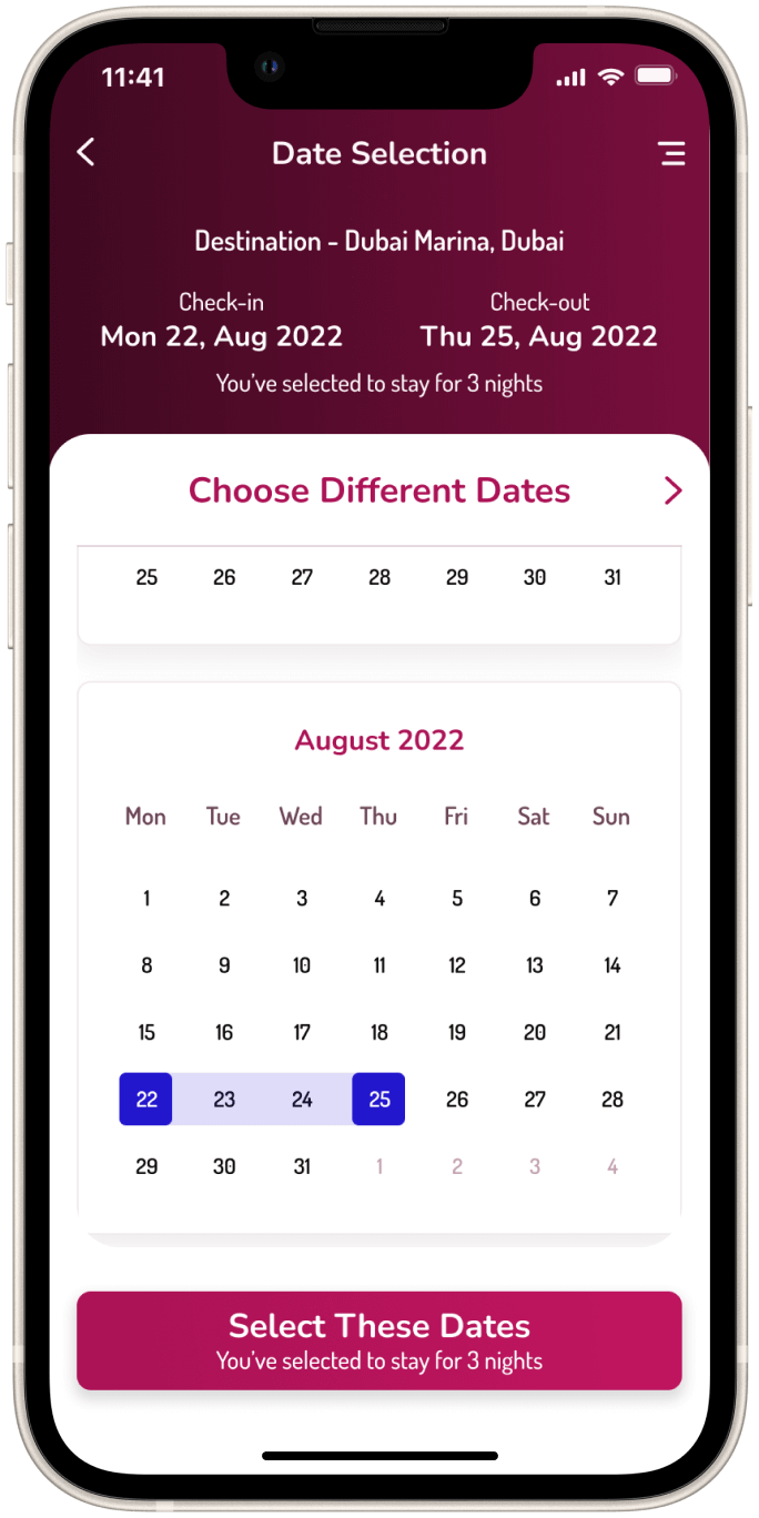
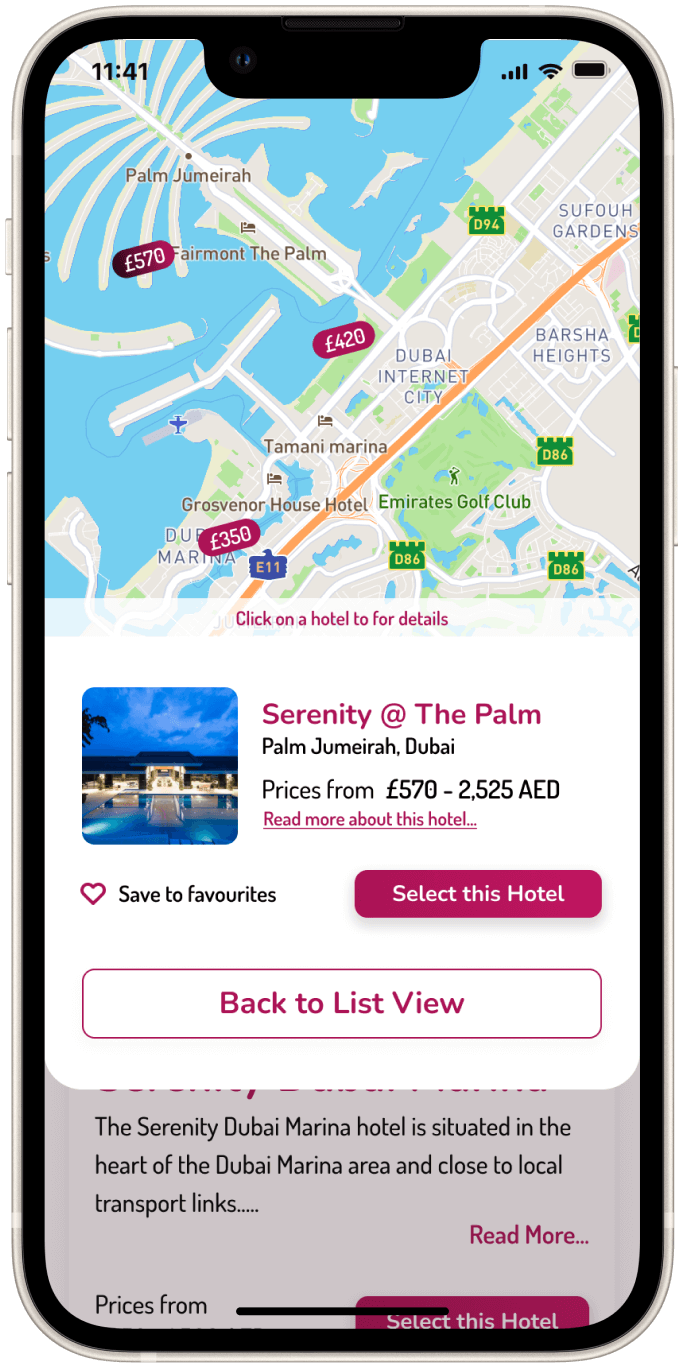
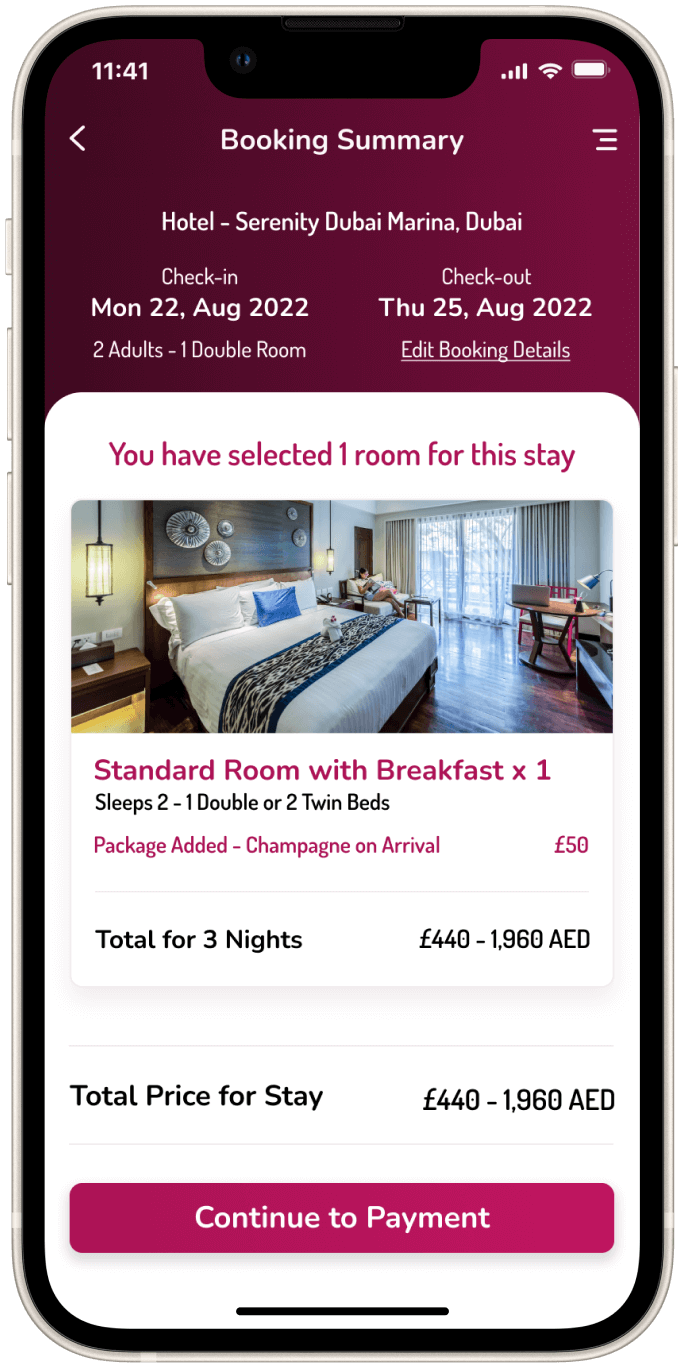
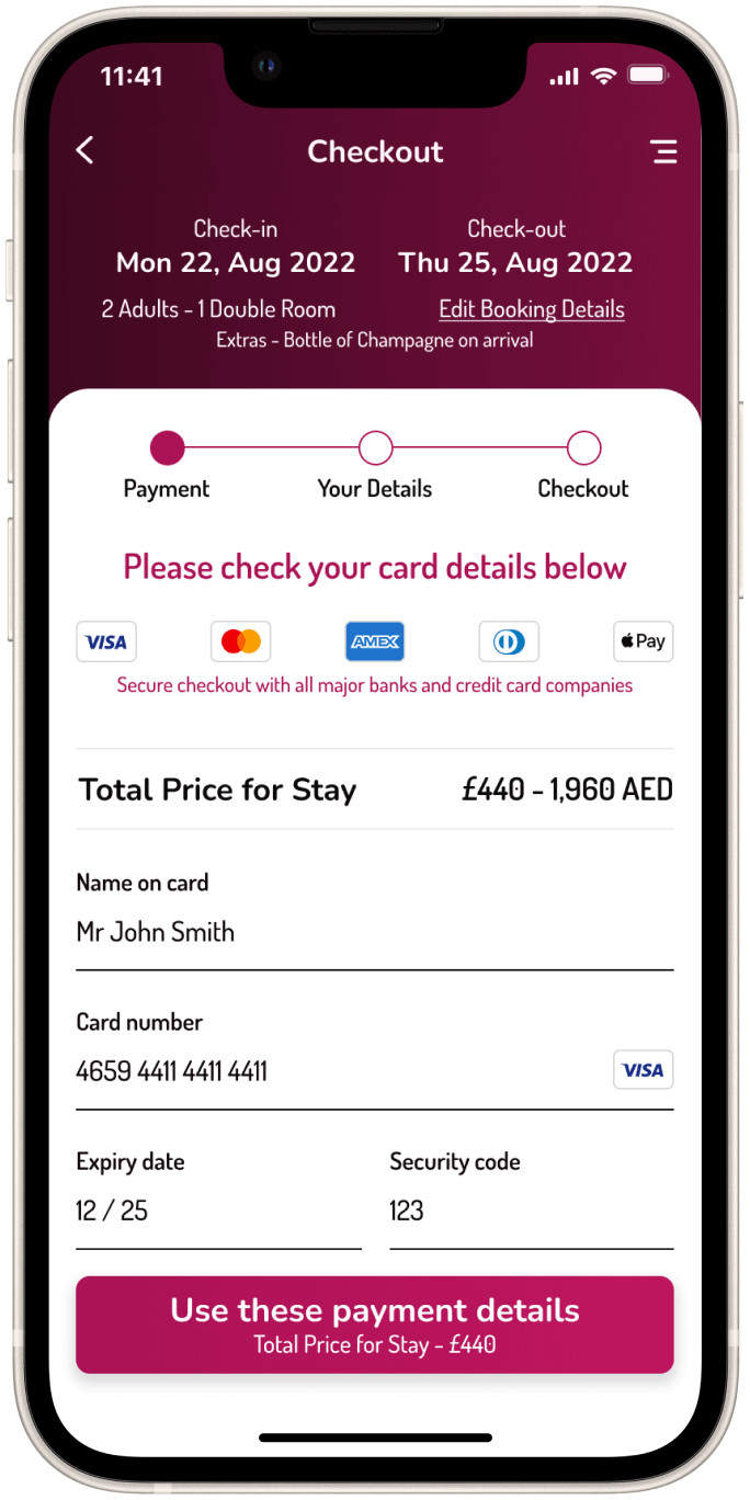
User Interface Design
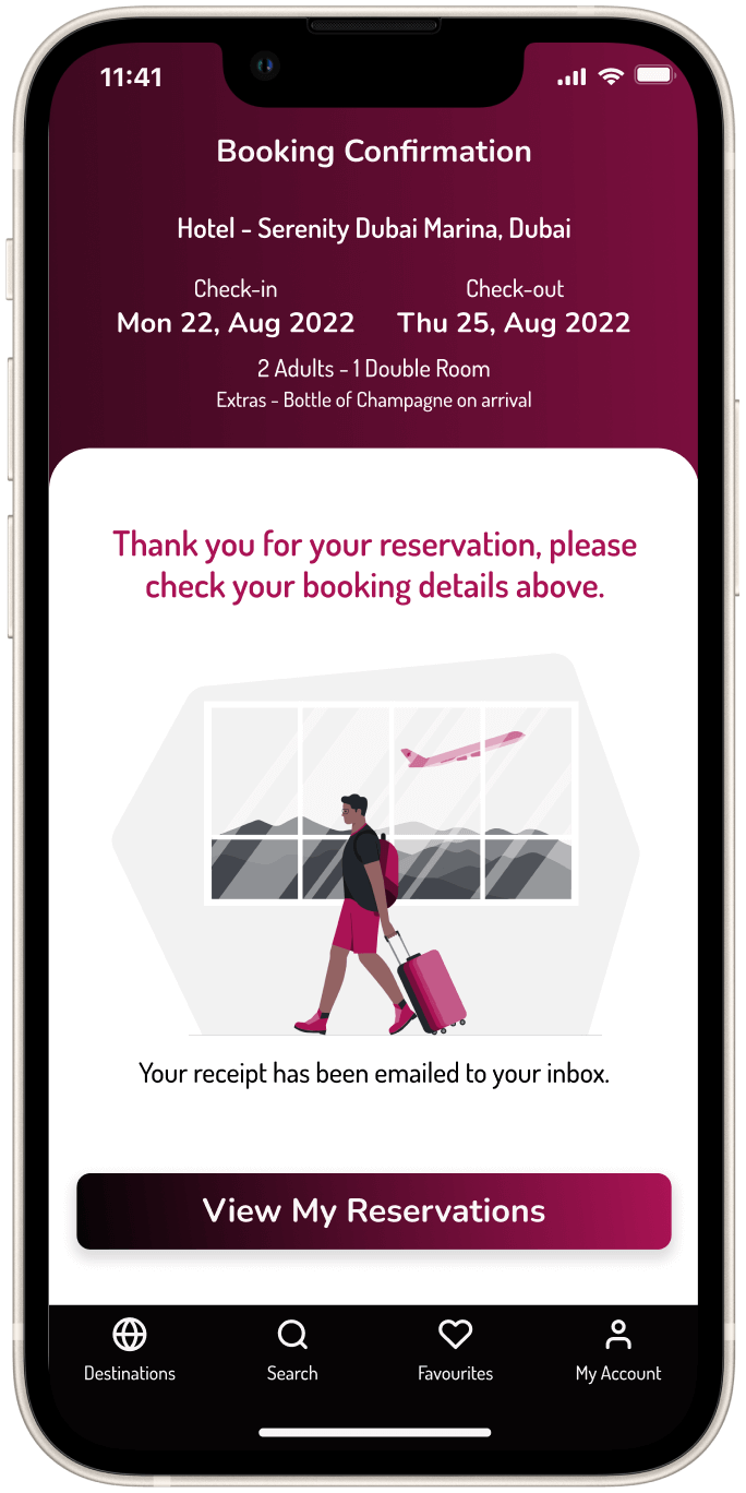
UX/UI Design & Prototype #5
Prototype
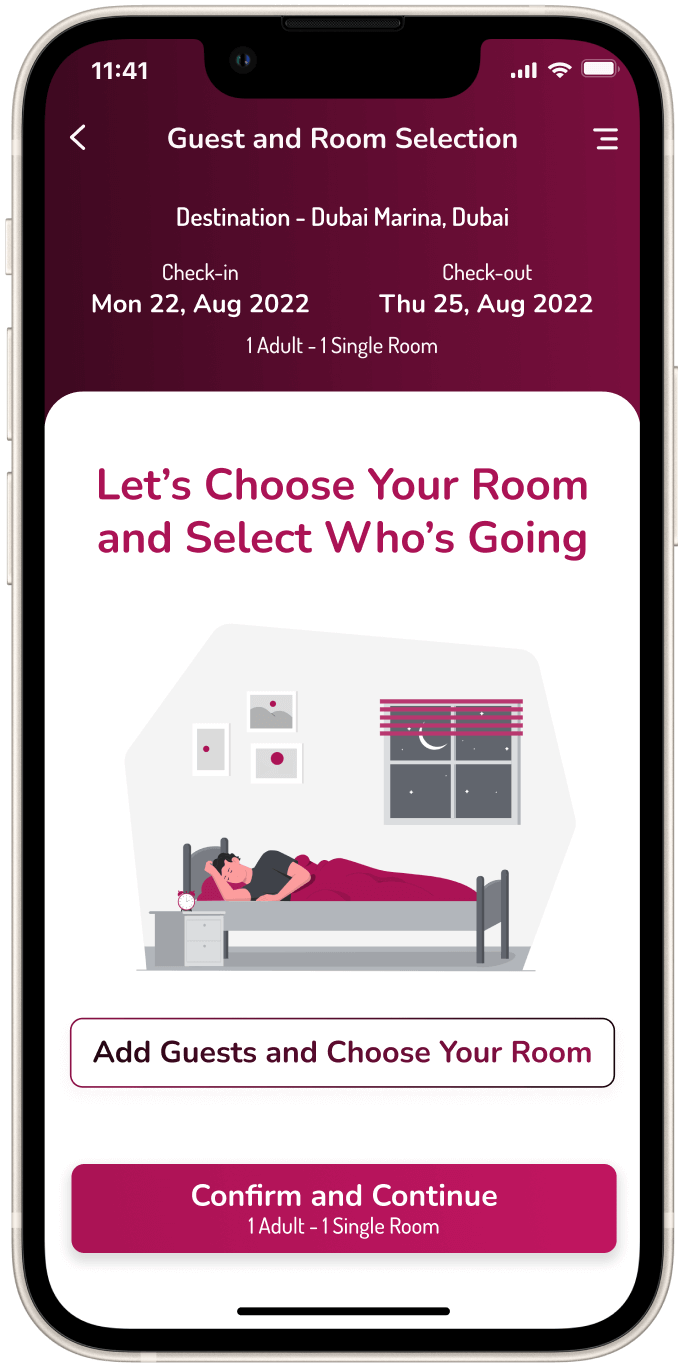
The prototype is available for you to check out the booking process of the new Serenity Hotels and Resorts App.
UX/UI Design & Prototype #6
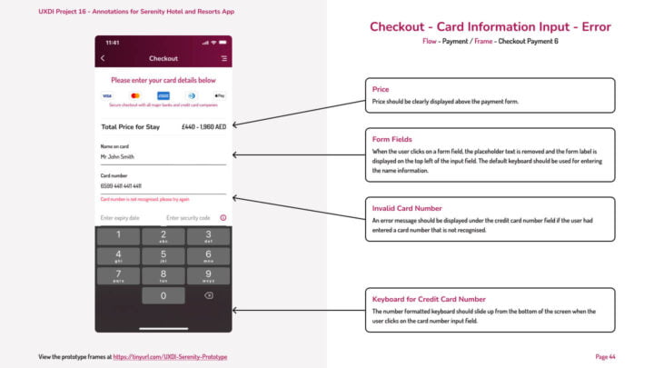
Developer Handover Documentation
Once the prototype was completed, the screens were then annotated with the information the development team will need to understand and complete the build of the Serenity Hotels and Resorts app.
UX/UI Design & Prototype #7
What's Next?
Product Validation Testing
The app still needs some further improvements, before these are undertaken, more usability testing will be needed to be performed to iron out any issues that users may find frustrating. To be continued…
Looking to Start Your Next UX/UI Project
Get in touch to find out what solutions I can provide your business. I'd love to hear about any of your ideas and support you in reaching your goals!
Contact Me
Take your UX, UI or Web Design project to the next level? Let's work together on something amazing!
Get In Touch by Email
